Suunto Or Garmin? The Age Old Question.
1 Note
This blog post was originally written in 2017 for a less formal personal blog with a focus on ultramarathon running, which is a hobby that I am quite passionate about. I have decided to include all of my data science related blog posts here to keep things centralised, but please excuse the more informal language used throughout.
2 Introduction
In my last post, I took a look at ways to pull data down from Twitter and analyse some specific trends. It was quite interesting for me to see how easy it is to access these data, and there is a huge amount to be gleened from these sorts of data. The idea of this post is to use a similar approach to pull data from the Ultra Running Community page on Facebook, and then to use these data to play around further with the dplyr, tidyr and ggplot2 R packages. Just for funsies, I’m also going to have a bit of a crack at some machine learning concepts. In particular, a question that seems to comes up pretty regularly is whether the best GPS watch for running is from Suunto or Garmin. I figured I could save us all some time and answer the question once and for all…
Just a little aside here; I think that some people missed the point last time. I honestly don’t care much about these questions, they are just a jumping off point for me to practice some of the data analysis techniques that come up in my work. The best way to get better at something is to practice, so these posts are just a way of combining something I love with a more practical purpose. The idea of this blog is for me to practice these things until they become second nature. Of course in the process, I may just find something interesting along the way.
Probably not though.
3 Rfacebook
Following on from my experiences playing around with the Twitter API, I decided to have a look to see if there were similar programmatic ways to access Facebook data. This can be accomplished using the Rfacebook package in R, which is very similar to the TwitteR package that I used previously. This package accesses the Facebook Graph API Explorer, allowing access to a huge amount of data from the Facebook social graph.
So first of all, let’s install the Rfacebook package. We can install the stable version from the Comprehensive R Archive Network (CRAN):
install.packages("Rfacebook")Or install the more up-to-date but less stable developmental version from Github:
library("devtools")
install_github("pablobarbera/Rfacebook/Rfacebook")
I am using the developmental version here. There are several additional packages that also need to be installed:
install.packages(c("httr", "rjson", "httpuv"))As with TwitteR, access to the API is controlled through the use of API tokens. There are two ways of doing this - either by registering as a developer and generating an app as I did with TwitteR, or through the use of a temporary token which gives you access for a limited period of 2 hours. Let’s look at each of these in turn:
3.1 Temporary Token
To generate a temporary token, just go to the Graph API Explorer page and generate a new token by clicking on Get Token -> Get Access Token. You need to select the permissions that you want to grant access for, which will depend on what you are looking do:
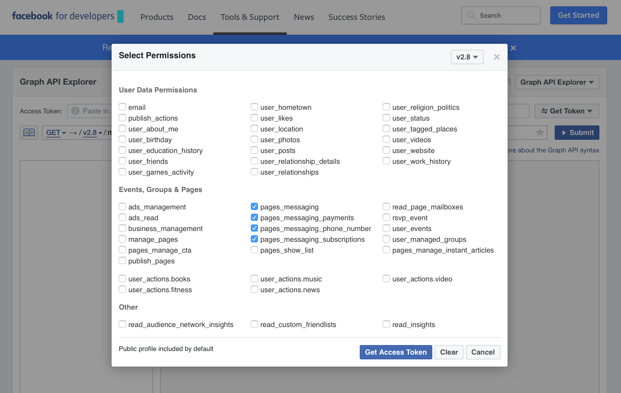
Create Temporary Access Token
I just granted permission to everything for this analysis. Once you have an access token, this can be used as the token parameter when using functions such as getUsers().
3.2 fbOAuth
The above is the most simple method, but this access token will only last for 2 hours, at which point you will need to generate a new one. If you want a longer term solution, you can set up Open Authorization access in a similar way to for the TwitteR package. The downside is that you lose the ability to search friend networks unless your friends are also using the app that you generate - and I don’t want to inflict that on people just so that I can steal their identity analyse their networks.
This method is almost identical to the process used for generating the OAuth tokens in the TwitteR app, and a good description of how to do it can be found in this blog post.
However, I am feeling pretty lazy today and so I will just use the temporary method.
4 Ultra Running Community
With nearly 18,000 members, the Ultra Running Community Facebook page is a very active community of ultrarunners from around the world. Runners are able to ask questions, share blogs, and generally speak with like-minded individuals about everything from gear selection to how best to prevent chaffing when running. It’s been going since June 2012, so there are a fair few posts available to look through.
So let’s load in all of the posts from the URC page:
library("Rfacebook")
token <- "XXXXXX"  ## Insert your temporary token from Graph API Explorer
URC <- getGroup("259647654139161", token, n=50000)
This command will create an object of class data.frame containing the most recent 50,000 posts available in the Facebook Group with ID 259647654139161 (which is the internal ID for the Ultra Running Community page). The page was set up in June 2012 By Neil Bryant, and currently (as of 20th March 2017) contains a total of 24,836 posts. So this command will actually capture every single post.
The data.frame is somewhat of the workhorse of R, and looks to the user like a spreadsheet like you would expect to see in Excel. Behind the scene it is actually a list of lists, with each column representing a particular measurement or descriptive annotation of that particular datum. The ideal situation is to design your data frame such that every row is an individual measurement, and every column is some aspect relating to that measurement. This can sometimes go against the instinctual way that you might store data, but makes downstream analyses much simpler.
As an example, suppose that you were measuring something (blood glucose levels, weight, lung capacity, VO2 max, etc.) at three times of the day for 2 individuals. Your natural inclination may be to design your table in this way:
| Sample | Measurement 1 | Measurement 2 | Measurement 3 |
|---|---|---|---|
| Sample1 | 0.3 | 0.4 | 0.3 |
| Sample2 | 0.6 | 0.6 | 0.7 |
But actually the optimum way to represent this is to treat each measurement as a different row in your data table, and use a descriptive categorical variable to represent the repeated measurements:
| Sample | Measurement | Replicate |
|---|---|---|
| Sample1 | 0.3 | 1 |
| Sample1 | 0.4 | 2 |
| Sample1 | 0.3 | 3 |
| Sample2 | 0.6 | 1 |
| Sample2 | 0.6 | 2 |
| Sample2 | 0.7 | 3 |
You can then add additional information relating to each individual measurement, which can be factored into your model down the line.
In this case, we have a data frame where each row is a post on the URC feed, and each column gives you information on the post such as who wrote it, what the post says, when it was written, any links involved, and how many likes, comments and shares each post has. We can take a quick look at what the data.frame looks like by using the str() function. This will tell us a little about each column, such as the data format (character, numeric, logical, factor, etc.) and the first few entries in each column:
str(URC)## 'data.frame': 24836 obs. of 11 variables:
## $ from_id : chr "10203232759527000" "10154582131480554" "10206266800967107" "10153499987966664" ...
## $ from_name : chr "Steph Wade" "Esther Bramley" "Tom Chapman" "Polat Dede" ...
## $ message : chr "Anyone who runs in Speedcross 3s tried Sportiva? I've had several pairs of Speedcross but thinking about tryin"| __truncated__ "Hi guys server pain in knee two weeks after 41miler. Ran 3 miles Tuesday no problem. Pain started at 5m and got"| __truncated__ "mega depressed; need advice. Running really well over xmas, since then, painful hip & groin, chasing itb, glute"| __truncated__ NA ...
## $ created_time : chr "2017-03-19T08:38:15+0000" "2017-03-18T12:19:26+0000" "2017-03-18T16:30:54+0000" "2017-03-19T08:42:38+0000" ...
## $ type : chr "status" "status" "status" "photo" ...
## $ link : chr NA NA NA "https://www.facebook.com/tahtaliruntosky/photos/a.659614340816057.1073741827.659609490816542/1145262965584523/?type=3" ...
## $ id : chr "259647654139161_1064067560363829" "259647654139161_1063418100428775" "259647654139161_1063562803747638" "259647654139161_1064068937030358" ...
## $ story : logi NA NA NA NA NA NA ...
## $ likes_count : num 0 0 0 0 0 2 2 58 7 1 ...
## $ comments_count: num 5 23 9 0 25 9 4 64 77 12 ...
## $ shares_count : num 0 1 0 0 0 0 0 0 3 0 ...5 Likes, Comments and Shares
The first step in any data analysis is to check that the data make sense. You’ve probably heard the old adage “garbage in; garbage out”, so data cleaning is an essential first step to ensure that we are not basing our conclusions on erroneous information from the beginning. There are far too many posts here to look at them all by hand, but there are a few things we can certainly have a look at to check that the values make sense.
For instance, let’s take a look at the number of likes, comments and shares. We would expect all of these values to be positive whole numbers, so this is something that is easy to check. To do this, I will be making use of the ggplot2 package, which allows for some incredibly powerful plotting in R. The idea is to define the plot in terms of aesthetics, where different elements of the plot (x and y values, colour, size, shape, etc.) can be mapped to elements of your data.
In this case I want to plot a distribution plot where the colour of the plot is mapped to whether we are looking at likes, comments or shares. To do this, I need to rearrange the data such that the likes_count, comments_count and shares_count columns are in a single column counts, with an additional column defining whether it is a like, a comment, or a share count (as described in the example above).
I will use the tidyr, stringr and dplyr packages to rearrange the data:
library("tidyr")
library("dplyr")
library("stringr")
like_comment_share <- URC                                                 %>%
                      gather(count_type, count, likes_count:shares_count) %>%
                      select(count_type, count)
head(like_comment_share)
## count_type count
## 1 likes_count 0
## 2 likes_count 0
## 3 likes_count 0
## 4 likes_count 0
## 5 likes_count 0
## 6 likes_count 2tidyr, stringr and dplyr are incredibly powerful packages written by Hadley Wickham, which provide a simple to understand grammar to apply to the filtering and tweaking of data frames in R. In particular, these can be used to convert the data into the tidy format described above, allowing very simple and intuitive plotting with ggplot2. One particularly useful feature is the ability to use the %>% command to pipe the output to perform multiple data frame modifications.
In the above code, we pipe the raw data URC into the gather() function, which will take the three columns from likes_count through to shares_count and split them into two new columns: count_type which will be one of shares_count, likes_count and comments_count , and count which will take the value from the specified column. So essentially this produces a new data set with 3 times as many rows. This is then piped into select() which will select the relevant columns.
First let’s just check that they are are all positive integers as expected:
all(like_comment_share$count == as.integer(like_comment_share$count))[1] TRUE
all(like_comment_share$count >= 0)[1] TRUE
Annoyingly there is no easy way to check that a vector of numbers is made up of integers, so this line will check that the numbers do not change after converting to integers. Similarly, we use all() to check that all of the counts are greater than or equal to zero. They are as we would hope.
Then we can use ggplot2 for the plotting:
library("ggplot2")
ggplot(like_comment_share, aes(x = log10(count+1), col = count_type, fill = count_type)) +
  geom_density(alpha = 0.1) +
  labs(x = "Count (log10)", y = "Density") +
  theme(axis.text    = element_text(size = 16),
        axis.title   = element_text(size = 20),
        legend.text  = element_text(size = 18),
        legend.title = element_text(size = 24))
Here we use this output to plot a distribution plot showing the distribution of counts for the three different metrics – shares, comments and likes. We use the count as the x aesthetic, and count_type as both the col and fill aesthetics to colour them. The main function ggplot() will specify the aesthetics, and then we add additional elements to the plot by using the + command. Here we add the geom_density() element to plot the data in a density plot (the alpha value will make the colours transparent for overplotting), the labs() function will change the plot labels, and the theme() function let’s you change aspects of the figure text, such as the size.
Note that here I have plotted the \(log_{10}\) of the counts, which reduces the effects of outliers. Also note that I have added 1 to the counts. This is because \(log_{10}(0)\) is undefined. The idea here is that a count of 1 will get a value of 0, a count of 10 gets a value of 1, a count of 100 gets a value of 2, etc.
So what does this tell us? Well not too much really. Not many people share posts from the page, but there aren’t too many that don’t get comments or likes. So it is a very active community. Posts tend to have more comments than likes, which makes sense because you can only like something once, but can comment as many times as you want. But the main thing that this shows is that these counts all seem to be in the right sort of expected range.
Often exploratory plots like this can be useful to highlight problems in the raw data. One such example might be if a negative count existed in these data, which could happen due to input errors but quite clearly does not represent a valid count. As it happens, since these data are not manually curated, it is highly unlikely that such errors will be present, but you should never assume anything about any given data set.
6 Top Contributors
Let’s take a look at the all-time most common contributors to the page, again using the ggplot2 package:
top_contributors <- URC              %>%
                    count(from_name) %>%
                    top_n(50, n)     %>%
                    arrange(desc(n))
ggplot(top_contributors,
       aes(x = factor(from_name, levels = top_contributors$from_name),
           y = n,
           fill = n)) +
  geom_bar(stat = "identity") +
  scale_fill_gradient(low="blue", high="red") +
  labs(x = "", y = "Number of Posts") +
  theme(axis.title  = element_text(size = 18),
        axis.text.x = element_text(size = 12, angle = 45, hjust = 1),
        axis.text.y = element_text(size = 14),
        legend.position = "none")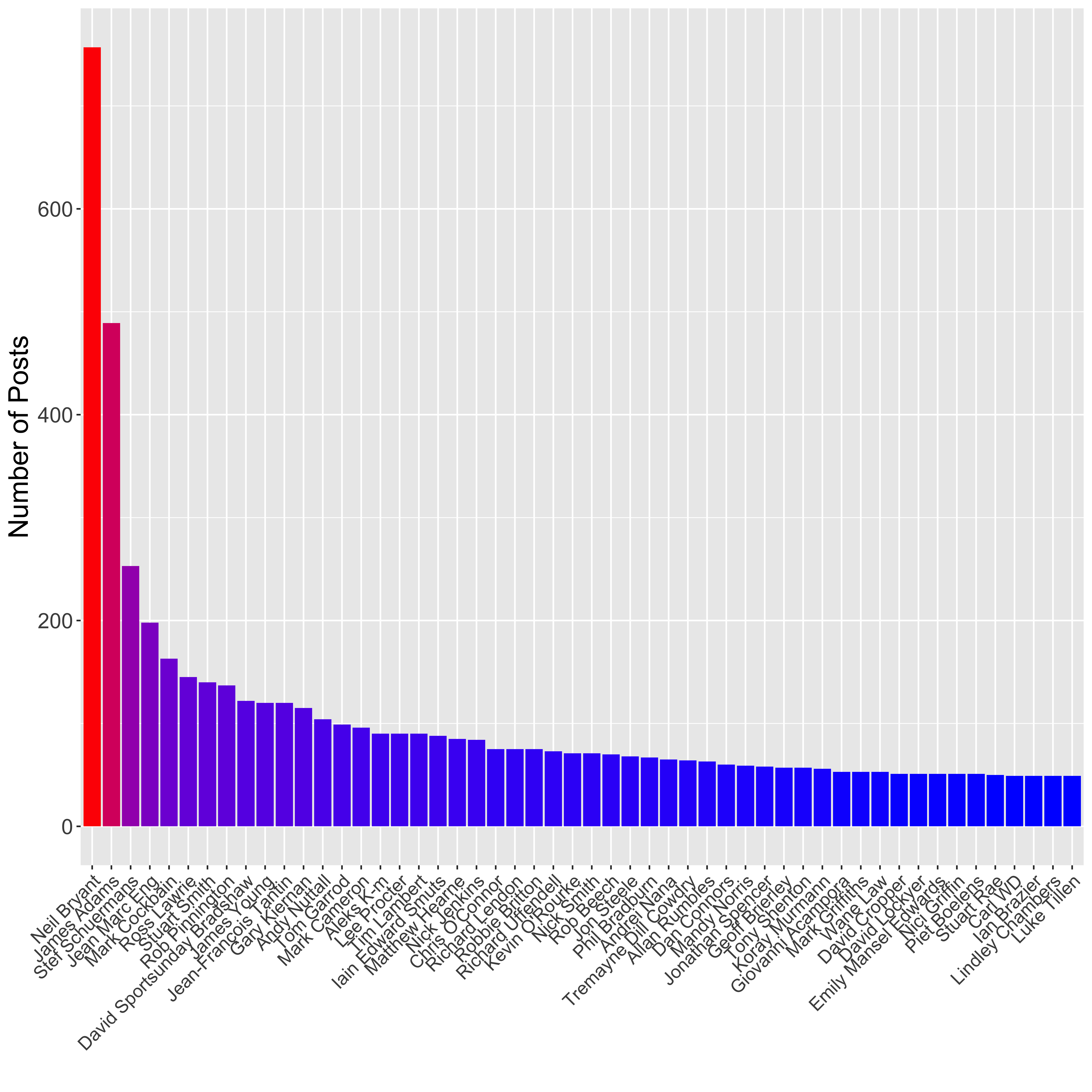
Here I have first used dplyr to count up the number of posts per user and select the top 50 contributors, then used ggplot2 to plot a barplot showing the number of posts per person. I have used the scale_fill_gradient() element to colour the bars based on their height, such that those with the highest number of posts are coloured red, whilst those with the lowest are coloured blue.
The top contributor to the page is Neil Bryant (757 posts), who is the founder member so this makes sense. James Adams is the second biggest contributor (489 posts), and he has less of an excuse really.
Let’s take a look at James’ posting habits:
library("xts")
jamesadams <- URC                                                        %>%
              filter(from_name == "James Adams")                         %>%
              mutate(created_time = as.POSIXct(created_time))            %>%
              count(created_time)
jamesadams_xts <- xts(jamesadams$n, order.by = jamesadams$created_time)
jamesadams_month <- apply.monthly(jamesadams_xts, FUN = sum)
plot(jamesadams_month, ylab = "Number of Posts", main = "", cex.lab = 1.7, cex.axis = 1.4)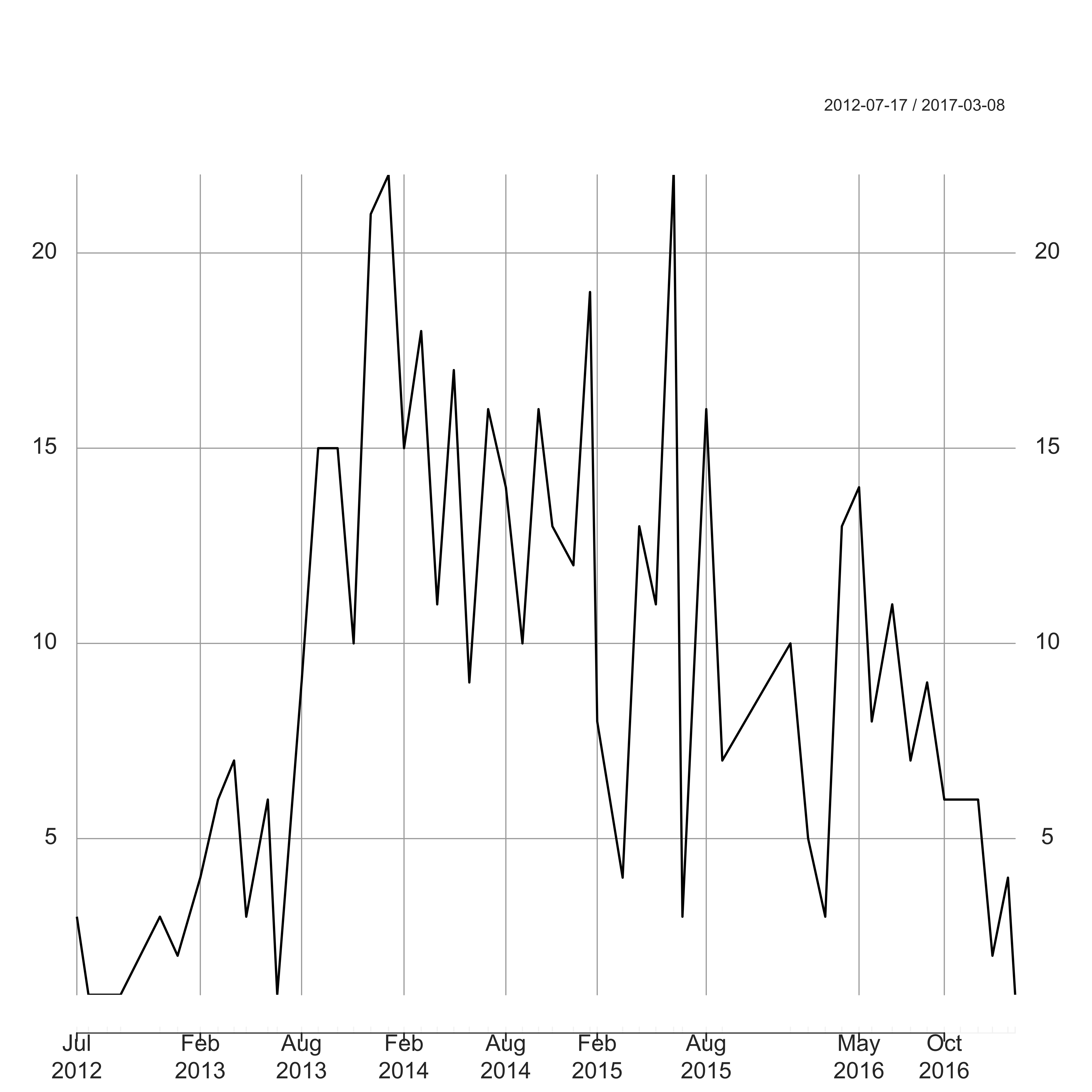
Here I have used the package xts to deal with the POSIXct date format. In particular this will deal correctly with months with zero counts. James has been pretty active since summer 2013 (probably publicising his book), but his activity has been on the decline throughout 2016 – the price you pay when your family size doubles I guess.
7 When are people posting?
Next we can break the posts down by the day on which they are posted:
URC      <- URC %>%
            mutate(dow = factor(weekdays(as.POSIXct(created_time)), labels = c("Monday", "Tuesday", "Wednesday", "Thursday", "Friday", "Saturday", "Sunday")))
post_day <- URC %>%
            count(dow)
ggplot(post_day, aes(x = dow, y = n, fill = dow)) +
  geom_bar(stat = "identity") +
  labs(x = "", y = "Number of Posts") +
  theme(axis.text.x = element_text(size = 20, angle = 45, hjust = 1),
        axis.text.y = element_text(size = 16),
        axis.title  = element_text(size = 20),
        legend.position = "none")
Similarly to previously, here I have used dplyr to reduce the full data down to a table of counts of posts per day of the week, then plotted them using ggplot2. Surprisingly (to me anyway) there is no increase in activity during the weekend. I guess most of us are checking Facebook during working hours and busy running at the weekend…
Wednesdays are interestingly bereft of posts though for some reason. Could this be people checking URC at work on Monday and Tuesday through boredom, only to find themselves told off and having to catch up on work by Wedesday? Then by the time the weekend rolls around we’re all back liking away with impunity ready to go through the whole process again the next week.
Let’s look at the same plot for the 1,000 most popular posts (based on likes):
post_day <- URC                      %>%
            top_n(1000, likes_count) %>%
            count(dow)
ggplot(post_day, aes(x = dow, y = n, fill = dow)) +
  geom_bar(stat = "identity") +
  labs(x = "", y = "Number of Posts") +
  theme(axis.text.x = element_text(size = 20, angle = 45, hjust = 1),
        axis.text.y = element_text(size = 16),
        axis.title  = element_text(size = 20),
        legend.position = "none")
So from this it is clear that if you want people to like your post, you should post on a Tuesday or a Thursday. Quite why people might be feeling so much more likely to click that all important like button on these dayas, I have no idea. But hey, stats don’t lie.
8 Most Popular Posts
So looking at the popular posts above got me thinking about how best to actually define a “popular” post. Is it a post with a lot of likes, or a post that everybody is commenting on? Let’s take a look at the top 5 posts based on each criteria:
print.AsIs(URC %>% arrange(desc(likes_count)) %>% top_n(5, likes_count) %>% select(message)) message1 Thinking how far I’ve come and getting a bit emotional. .3 year ago i was a size 20/22 and couldnt run to end of the street. Yesterday i ran 30 mile as a training run and wasn’t even aching afterwards. Now nearly 45 and a size 10 and never felt better. I love my life!!!! 2 I saw this picture couple years ago and I found it very inspiring so I thought I’d share it. is a 12-year-old childhood cancer survivor who loves to run with his dad. 3 Not sure if swear words are accepted. 088208820882 4 “What you doing up here?” said the sheep.Pike last night, not a soul to be seen… 5 0880
print.AsIs(URC %>% arrange(desc(comments_count)) %>% top_n(5, comments_count) %>% select(message)) message1 For me claiming something you haven’t earned is not only immoral it’s fraudulent. And it’s a huge insult to all who’ve attempted the feat before you and legitimately fallen short. What do you guys think? 2 Anyone else do race to the stones and found it a rip off? I was not impressed with most things. were good such as medics and lots of water but who wants fudge bars and cadburies at aid stations. like a money making race to me, especially considering all the sponsorship they had. ’ve got lots of other rants about it but let’s hear anyone else’s thoughts first 3 New Game.am trying to convince some new ultra runners that you do not need to spend a load of money on kit to put one foot in front of the other a few more times. This is difficult given that half the posts in forums seems to be asking for recommendations or giving recommendations as to how one might waste money on kit.out of interest, what was the value of the kit you wore in your last ultra? Including nutrition. Obviously you will have to guess if you had them as a gift or can’t remember. Surely someone is going to have less than £100? 4 I had a small sabre rattling session last night with someone on this group. Nothing major by any stretch of the imagination - we just have opposing views on DNF. But it got me curios to what the opinions of others are on this subject. Is failing to finish something that you would risk your life to avoid? Is it something to fear? Is it something that will eventually happen to us all? Is it something that we can learn from? Etc,etc. Your thoughts please 5 i cannot wait to watch the EPSN footage - amazing stuff. It is a shame Robert has his doubters though.: was described as “trolling”, which was an over the top description (agree with the comments there)
It seems to me that the posts with more likes tend to be posts with a much more positive message than those with most comments. The top liked posts are those from people who have overcome some form of adversity (such as the top liked post with 1,369 likes from Mandy Norris who had awesomely run 30 miles after losing half her body weight), whilst the top commented posts tend to be more controversial posts (such as the top commented post with 287 comments about Mark Vaz’s fraudulent JOGLE “World Record”).
Let’s take a look at how closely these two poularity measures are correlated in the Ultra Running Community:
ggplot(URC, aes(x = comments_count, y = likes_count)) +
  geom_point(shape = 19, alpha = 0.2, size = 5) +
  geom_smooth(method = "lm", se = TRUE) +
  geom_point(data = URC %>% top_n(5, comments_count), aes(x = comments_count, y = likes_count, color = "red", size = 5)) +
  geom_point(data = URC %>% top_n(5, likes_count), aes(x = comments_count, y = likes_count, color = "blue", size = 5)) +
  labs(x = "Number of Comments", y = "Number of Likes") +
  theme(axis.text   = element_text(size = 16),
        axis.title  = element_text(size = 20),
        legend.position = "none")
Here we are plotting a correlation scatterplot between the number of likes and the number of comments for each post. I have a set an alpha value of 0.2 for the scatterplot so that the individual points are made more see-through. That way, overplotting can be seen by darker coloured plots. I have also added in a line of best fit generated by fitting a linear model (method= lm), together with an estimate of the standard error shown by the grey surrounding of the blue line (se = TRUE). Finally I have highlighted the top 5 commented posts in blue, and the top 5 liked posts in red.
It is pretty clear from this plot that there is virtually no correlation between the number of comments and the number of likes, particularly for those with more likes or comments. In general the posts with more likes do not have the most comments (and vice versa), suggesting that in general we like the nice posts, but comment on the ones that upset us. In fact, it looks as if Mandy’s post is the only exception, with both the highest number of likes but also a high number of comments (220).
We can calculate the correlation between these measures, which is a measure of the linear relationship between two variables. A value of 1 indicates that they are entirely dependent on one another, whilst a value of 0 indicates that the two are entirely independent of one another. A value of -1 indicates an inverse depdnedancy, such that an increase in one variable is associated with a similar decrease in the other variable. Given the difference in the scales between likes and comments, I will use the Spearman correlation, which looks at correlation between the ranks of the data and therefore ensures that each unit increment is 1 for both variables meaning that it is robust to outliers. The Spearman correlation between these two variables is 0.27, so there is virtually no correlation between likes and comments.
9 How Often Do People Actually Talk About Ultras?
It seems recently that there is more talk of charlatans and frauds than races, and a lot of people have commented on the fact that there seems to be less and less actual discussion of ultras recently. So let’s see if this is the case, by tracking how often the term ultra is actually used over time:
ultraposts <- URC                                                        %>%
              filter(str_detect(message, "ultra"))                       %>%
              mutate(created_time = as.POSIXct(created_time))            %>%
              count(created_time)
ultraposts_xts <- xts(ultraposts$n, order.by = ultraposts$created_time)
ultraposts_month <- apply.monthly(ultraposts_xts, FUN = sum)
plot(ultraposts_month, ylab = "Number of Ultra Posts", main = "")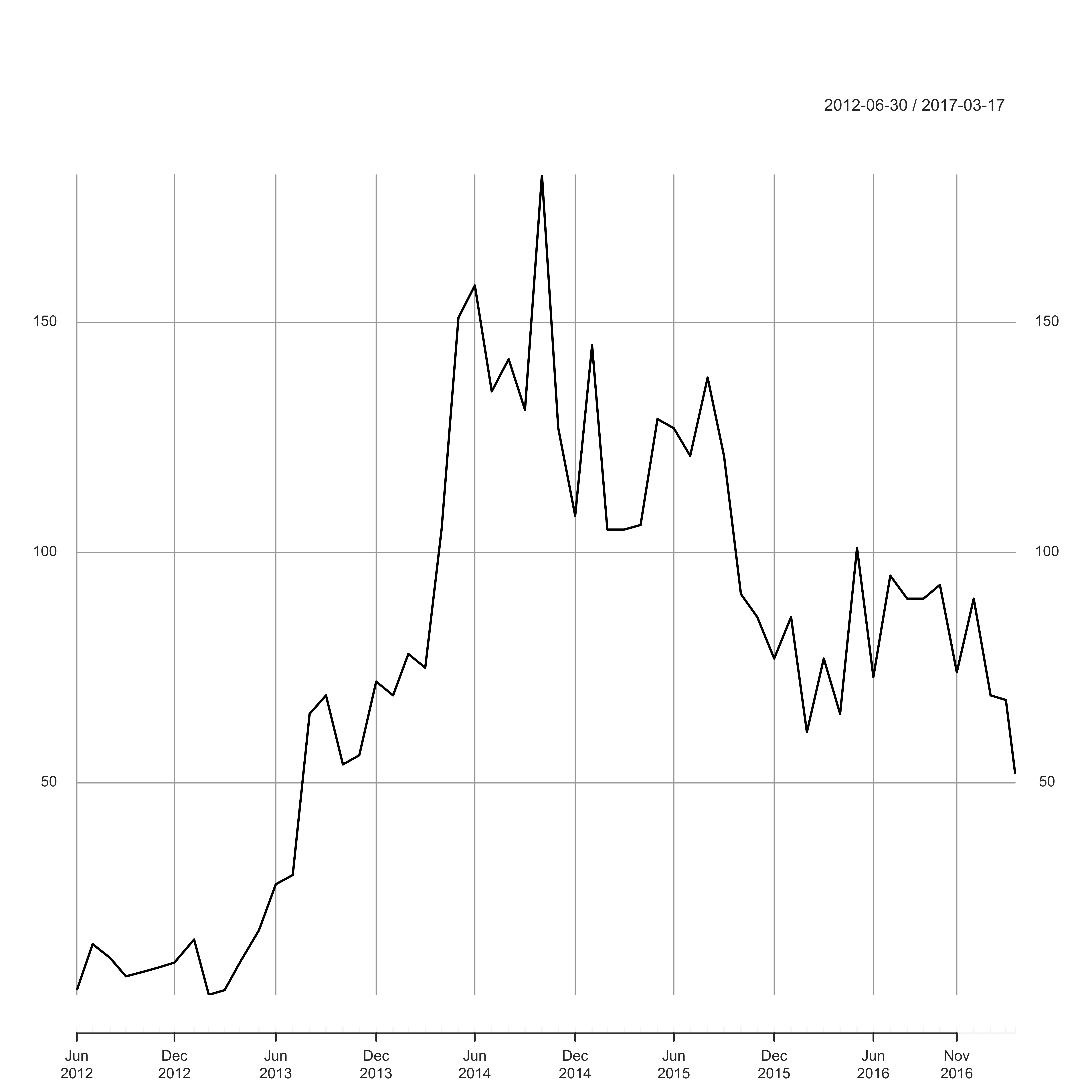
Over the last year or so, the number of people in the group has risen dramatically, and yet it certainly seems that fewer people are actually discussing ultras these days. I guess read into that what you will – perhaps the feed is indeed dominated by Suunto vs Garmin questions?
Hell, let’s find out.
10 Suunto or Garmin?
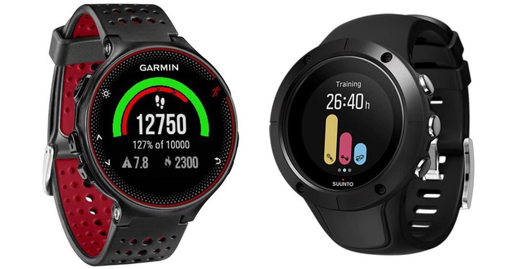
So let’s take a look at the real question that everybody cares about – which is more popular, Suunto or Garmin. All my cards on the table; I have a Suunto Peak Ambit 3, but if it helps I had to Google that because I really don’t keep up on these things. I’m really not a gear not, and prefer to make do. The only reason that I got this is that my previous watch died a death, and I like to use a watch for navigation. I didn’t pay for it – at that price I couldn’t bring myself to fork out the money. But it was a gift, and I am very pleased with it. It has a great battery life, and is pretty simple when loading data to my computer. Despite being a stats guy, I don’t normally focus much on my own data, but actually it has been interesting to see how slow I have become recently due to an ongoing injury. Perhaps it will help me to push myself in training onece it is sorted.
But as I understand it, the Garmin Fenix 3 does exactly the same stuff. Is one better than the other? I couldn’t possibly say. Many people have tried, but I suspect that it comes down to personal preference rather than there being some objective difference between the two.
But just for the hell of it, let’s see how often people talk about the two. I will be simply using fuzzy matching to look for any use of the terms “suunto” or “garmin” in the post. Fuzzy matching is able to spot slight misspellings, such as “Sunto” or “Garmin”, and is carried out using the base agrep() function in R:
suunto <- agrep("suunto", URC$message, ignore.case = TRUE)
garmin <- agrep("garmin", URC$message, ignore.case = TRUE)
pie(c(length(setdiff(suunto, garmin)), length(setdiff(garmin, suunto)), length(intersect(suunto, garmin))), labels = c("Suunto", "Garmin", "Both"), cex = 2)
So of the 24,836 posts on the URC page, 237 (0.95 %) mention Suunto, whilst 552 (2.22 %) mention Garmin. Only 77 (0.3 %) mention both, which I assume are the posts specifically asking which of the two is best. Given the way some people moan about how often this question comes up, these numbers are actually surprisingly small I think. But based on this it seems that Garmin is more popular, although it would be interesting to look at the actual responses on those “VS” posts to see what the outcome actually was in each case.
Having said that, there is nothing to suggest what these posts about Garmin’s are actually saying. They may be generally saying that they hate Garmins. So I am going to play around with a bit of sentiment analysis using the qdap package. Essentially this is a machine learning algorithm that has been trained to identify the sentiment underlying a post, with positive values representing a generally positive sentiment (and vice versa). So let’s break down the Garmin and Suunto posts to see how they stack up:
library("qdap")

## Convert to ASCII and get rid of upper case
suunto_msg <- URC$message[suunto]                %>%
              iconv("latin1", "ASCII", sub = "") %>%
              tolower
garmin_msg <- URC$message[garmin]                %>%
              iconv("latin1", "ASCII", sub = "") %>%
              tolower

## Calculate the sentiment polarity
suunto_sentiment <- polarity(gsub("[[:punct:]]", "", suunto_msg))
garmin_sentiment <- polarity(gsub("[[:punct:]]", "", garmin_msg))

## Plot in a stacked barplot
sent_dat <- data.frame(Watch     = c(rep("Suunto", length(suunto)),
                                     rep("Garmin", length(garmin))),
                       Sentiment = c(suunto_sentiment$all$polarity,
                                     garmin_sentiment$all$polarity))
ggplot(sent_dat, aes(x = Sentiment, col = Watch, fill = Watch)) +
  geom_density(alpha = 0.1) +
  labs(x = "Sentiment Polarity", y = "Density") +
  theme(axis.text    = element_text(size = 16),
        axis.title   = element_text(size = 20),
        legend.text  = element_text(size = 18),
        legend.title = element_text(size = 24))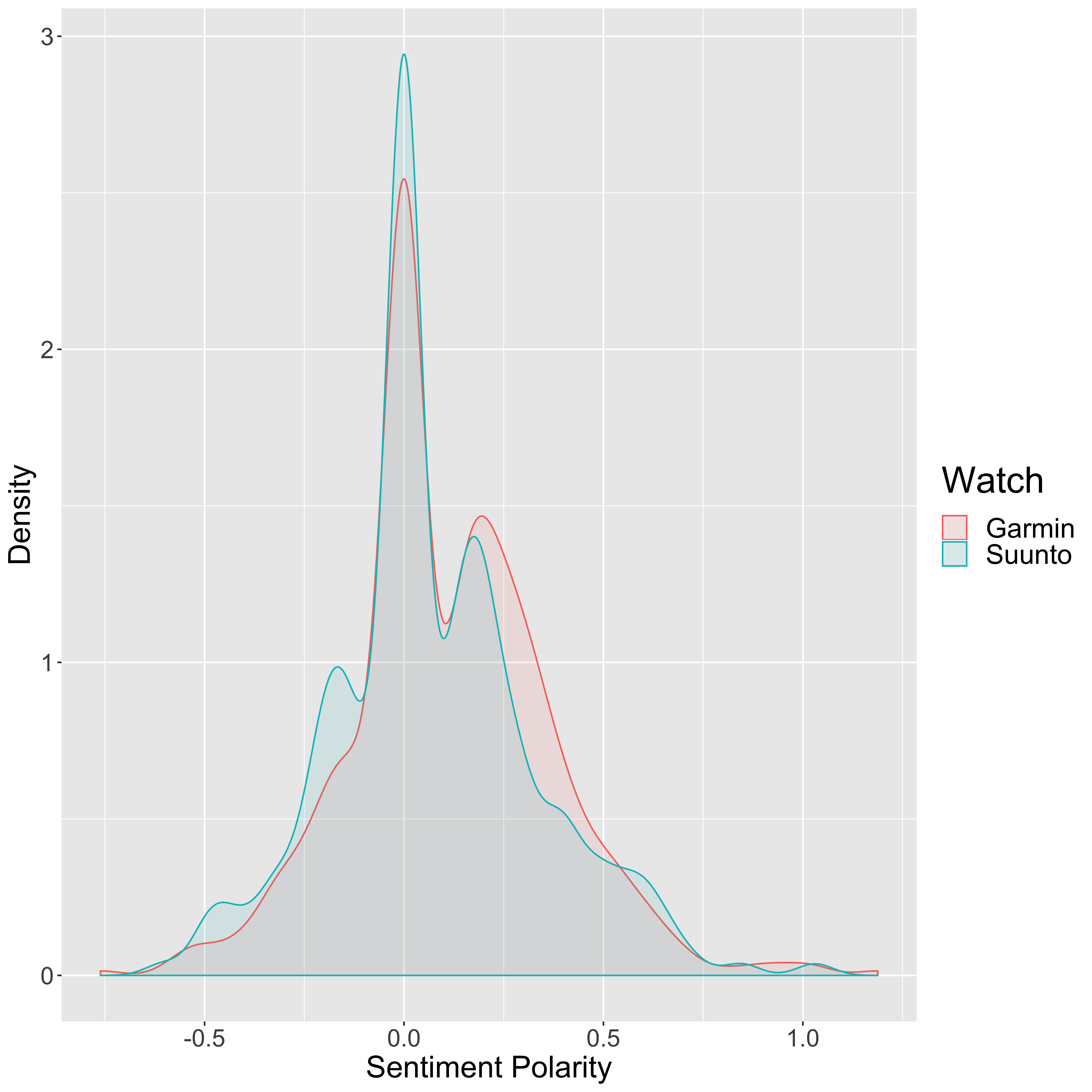
So a value of zero on this distribution plot suggests a neutral sentiment to the post, a positive number suggests a positive sentiment, and a negative number suggests a negative sentiment. While the majority of the posts seem to be fairly neutral in both cases, it certainly seems that the majority of the Garmin posts are positive whilst the Suunto posts are more neutral with many positive and negative posts.
We can actually put a number on this, for whether or not there is truly a statistically significant difference between the distribution of sentiment scores for the two watches. To do this, we will us a statistical test that checks how likely it is that we would see a difference of the magnitude seen here given that there is no difference between what people actually think of the watch. This is the so-called “null-hypothesis”, and essentially says that there is no difference, and any differences that we do see are purely random errors. We can test this hypothesis using one of a number of different tests, with the aim to see whether there is evidence that we can reject this null hypothesis, thus suggesting that there is indeed a true difference between the distributions. So we never really “prove” that there is a difference, but instead show that there is suitable evidence to disprove the null hypothesis.
To do this some test statistic is calculated and is tested to see if it is significantly different than what you would expect to see by chance. Typically this is assessed using a “p-value”, which is one of the most misunderstood measurements in statistics. This value represents the probability that you would see a test statistic at least as high as that measured purely by chance, even if both sets of data were drawn from the same distribution. So both the Garmin and Suunto scores are a tiny subset of all possible opinions of people in the world, the population distribution. Our two sample populations are either drawn from an overall population where there is no difference, or from two distinct populations for people who have a view one way or the other.
It is pretty clear from the above figure that these values are not normally distributed (a so-called “bell-curve” distribution), so we cannot use a simple t-test which basically tests the difference in the means between two distributions (after taking the variance into account). Instead we would be better off using a non-parametric test which does not require the data to be parameterised into some fixed probability density function. The Kolmogorov Smirnov test is one method that can be used, and works by looking at how the cummulative distribution functions of two distinct samples differ:
ks.test(subset(sent_dat, Watch == "Suunto")[["Sentiment"]], subset(sent_dat, Watch == "Garmin")[["Sentiment"]])## Warning in ks.test(subset(sent_dat, Watch == "Suunto")[["Sentiment"]],
## subset(sent_dat, : p-value will be approximate in the presence of ties##
## Two-sample Kolmogorov-Smirnov test
##
## data: subset(sent_dat, Watch == "Suunto")[["Sentiment"]] and subset(sent_dat, Watch == "Garmin")[["Sentiment"]]
## D = 0.093653, p-value = 0.1091
## alternative hypothesis: two-sidedHere we run a two-sided test, which simply means that we have no a priori reason to suspect one distribution to be greater than the other. We could do a one-sided test where the alternative hypothesis that we are testing is “A is greater than B”, rather than the two-sided test where we are testing the alternative hypothesis that “A is not equal to B”. \(D\) is the maximum distance between the empirical distribution functions, and \(p\) is the p-value. Typically, a threshold used to reject the null hypothesis is for \(p\) to be less than 0.05 (5 %), although it is fairly arbitrary. But in this case, we would conclude that there is not sufficient evidence to reject the null hypothesis.
As an alternative, we can instead use the Wilcoxon rank sum test (also called the Mann-Whitney U test). The idea is to rank all of the data, sum up the ranks from one of the samples, and use this to calculate the test statistic \(U\) (which takes into account the sample sizes). So if the distributions are pretty similar, the sum of the ranks will be similar for sample 1 and sample 2. If there is a big difference, one sample will have more higher ranked values than the other, resulting in a higher value for \(U\). Let’s take a look at this:
wilcox.test(subset(sent_dat, Watch == "Suunto")[["Sentiment"]], subset(sent_dat, Watch == "Garmin")[["Sentiment"]])##
## Wilcoxon rank sum test with continuity correction
##
## data: subset(sent_dat, Watch == "Suunto")[["Sentiment"]] and subset(sent_dat, Watch == "Garmin")[["Sentiment"]]
## W = 59157, p-value = 0.03066
## alternative hypothesis: true location shift is not equal to 0Note that the test statistic here is actually \(W\), but in this case \(W\) and \(U\) are equivalent. So this test would result in us rejecting the null hypothesis with the same threshold as above. So which one is correct? Well, this is a great example of why you should never trust statistics. Both of these are perfectly reasonable tests to perform in this case but give different results. Many people would simply choose the one that gives the lowest p-value, but this is pretty naughty and is often called “p-hacking”. At the end of the day, a p-value higher than 0.05 does not mean that there is not a true difference between the distributions, just that the current data does not provide enough evidence to reject the null hypothesis.
So my conclusion from this is that I made the wrong decision, and will from now on look upon my useless Suunto watch with hatred and resentment. I can only hope that this post will save anyone else from making such an awful mistake.
11 Summing Up
It has been quite fun playing around with these data tonight, and I have had an opportunity to try out a few new techniques that I have wanted to play with for a while. As ever, there is loads more that can be gleaned from these data, but I should probably do something a little more productive right now. Like sleeping. I have actually done a while load more playing with machine learning algorithms of my own, but this post has already become a little too unruly so I will post this later as a separate post.
But in summary, people on the Ultra Running Community page spend far too much time posting during working hours, seem to be talking less and less about ultra running, and definitely prefer Garmins to Suuntos. So this has all been completely worth it.
12 Session Info
sessionInfo()## R version 3.6.1 (2019-07-05)
## Platform: x86_64-apple-darwin15.6.0 (64-bit)
## Running under: macOS Sierra 10.12.6
##
## Matrix products: default
## BLAS: /Library/Frameworks/R.framework/Versions/3.6/Resources/lib/libRblas.0.dylib
## LAPACK: /Library/Frameworks/R.framework/Versions/3.6/Resources/lib/libRlapack.dylib
##
## locale:
## [1] en_GB.UTF-8/en_GB.UTF-8/en_GB.UTF-8/C/en_GB.UTF-8/en_GB.UTF-8
##
## attached base packages:
## [1] stats graphics grDevices utils datasets methods base
##
## other attached packages:
## [1] qdap_2.3.2 RColorBrewer_1.1-2 qdapTools_1.3.3
## [4] qdapRegex_0.7.2 qdapDictionaries_1.0.7 xts_0.11-2
## [7] zoo_1.8-6 ggplot2_3.2.1 stringr_1.4.0
## [10] dplyr_0.8.3 tidyr_1.0.0 randomForest_4.6-14
##
## loaded via a namespace (and not attached):
## [1] Rcpp_1.0.2 lattice_0.20-38 xlsxjars_0.6.1
## [4] gtools_3.8.1 assertthat_0.2.1 zeallot_0.1.0
## [7] digest_0.6.22 slam_0.1-45 R6_2.4.0
## [10] plyr_1.8.4 chron_2.3-54 backports_1.1.5
## [13] evaluate_0.14 blogdown_0.16 pillar_1.4.2
## [16] rlang_0.4.1 lazyeval_0.2.2 data.table_1.12.6
## [19] gdata_2.18.0 rmarkdown_1.16 gender_0.5.2
## [22] labeling_0.3 igraph_1.2.4.1 RCurl_1.95-4.12
## [25] munsell_0.5.0 compiler_3.6.1 xfun_0.10
## [28] pkgconfig_2.0.3 htmltools_0.4.0 reports_0.1.4
## [31] tidyselect_0.2.5 tibble_2.1.3 gridExtra_2.3
## [34] bookdown_0.14 XML_3.98-1.20 crayon_1.3.4
## [37] withr_2.1.2 bitops_1.0-6 openNLP_0.2-7
## [40] grid_3.6.1 gtable_0.3.0 lifecycle_0.1.0
## [43] magrittr_1.5 scales_1.0.0 xlsx_0.6.1
## [46] stringi_1.4.3 reshape2_1.4.3 NLP_0.2-0
## [49] openNLPdata_1.5.3-4 xml2_1.2.2 venneuler_1.1-0
## [52] ellipsis_0.3.0 vctrs_0.2.0 wordcloud_2.6
## [55] tools_3.6.1 glue_1.3.1 purrr_0.3.3
## [58] plotrix_3.7-6 parallel_3.6.1 yaml_2.2.0
## [61] tm_0.7-6 colorspace_1.4-1 rJava_0.9-11
## [64] knitr_1.25Sam Robson
Lead Bioinformatician at the Centre for Enzyme Innovation
Lead Bioinformatician at the Centre for Enzyme Innovation